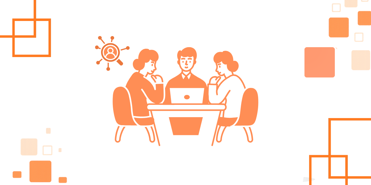
The Lanteria team always puts users first, aiming to create the best user experience while also offering a complex, multifunctional HRMS. We recently spent time interviewing our customers to better understand how they were using Lanteria HR, their needs and preferences, and decided to give our platform a refreshed look and feel.
The new design isn't a radical change, so if you’re familiar with the previous interface, you’ll easily and intuitively be able to find the pages and features that you need. But at the same time, the the changed we've made brings a fresh modern look to Lanteria HR and speeds up a lot of the common processes our customers use.
So, what has changed in the Lanteria HR interface?
1. First of all, the new UI is based on the Angular web application framework, which brings in a sleek new look and overhauled user experience throughout Lanteria HR.
2. The menu in the header now features a navigation bar with drop-down menu items, making navigation easier on devices with various form factors.
3. Every page, every control, and every icon has been revised. A fresh new look to every page - HR dashboards, employees - everything!
4. In the new learning catalog, learning materials are displayed in the form of tiles.
5. Some new features, tailored to the new UI, which you’ll be able to find only after you update to the latest version of Lanteria HR:
Notification Icon
With the redesigned header, along with the familiar action and controls, such as searching for employees, changing your role, quick actions, opening the chat bot or online help, you can see the new notifications icon with a number that tells how many new notifications you have.
Notification Pane
The new notifications pane shows the tasks that require your action, such as development activities from your development plan that you need to complete or actions pending your approval.
Dashboard for Employees
Our employee dashboard has been redesigned from the ground up. Now, instead of links to various areas, which are accessible from the menu, the new dashboard provides an overview of useful information with quick links to help employees manage their HR tasks faster.
Accessibility Tools for HR
In the updated user profile you can upload your photo, edit your details, open your portal, sign in as a different user, or view and edit your SharePoint profile.
See the Lanteria HR Updates in Action
Watch the following video and see for yourself that the new Lanteria HR design makes getting your job done easier:
Want to learn more about Lanteria HR?
Come see the latest and greatest with an HR platform that works your way. Centralize employee data securely in one place, streamline and automate time-consuming HR tasks, and free up time for people work, not paperwork!
Get more HR trends, news, tips and guides to streamline your operations. We promise we don’t spam.
We care about the protection of your data. Read our Privacy policy.
REVIEWS
Here’s what our customers say
Ekaterina K.
"Top-notch HR solution with excellent support team"
I was able to tailor the system to fit the unique needs of my organization, from creating custom fields to setting up workflows and approvals. This level of flexibility made it so easy to integrate into our existing HR processes, and it's made a real difference in our daily operations.
"Lanteria is a top SharePoint HR software with a great team behind it"
Lanteria HR is a great product that has even better team behind it. And as for a SharePoint-based product the Lanteria HR system looks very modern and runs quickly.
Akshay U.
"Lanteria is the most flexible and secure HRMS I had"
Our team is on Office 365, and Lanteria solves a big problem for us because it works so well with Microsoft products.
Hanna B.
"Al-star for employee performance management and reviews"
The Performance module gives us a straightforward dashboard where we can see all the vital stats about our employees' work performance. And, it updates in a flash so we're always in the know.


.png)